Inspired by the sunflower - a symbol of hope Sparenza Knee Centre helps you
step into light again.
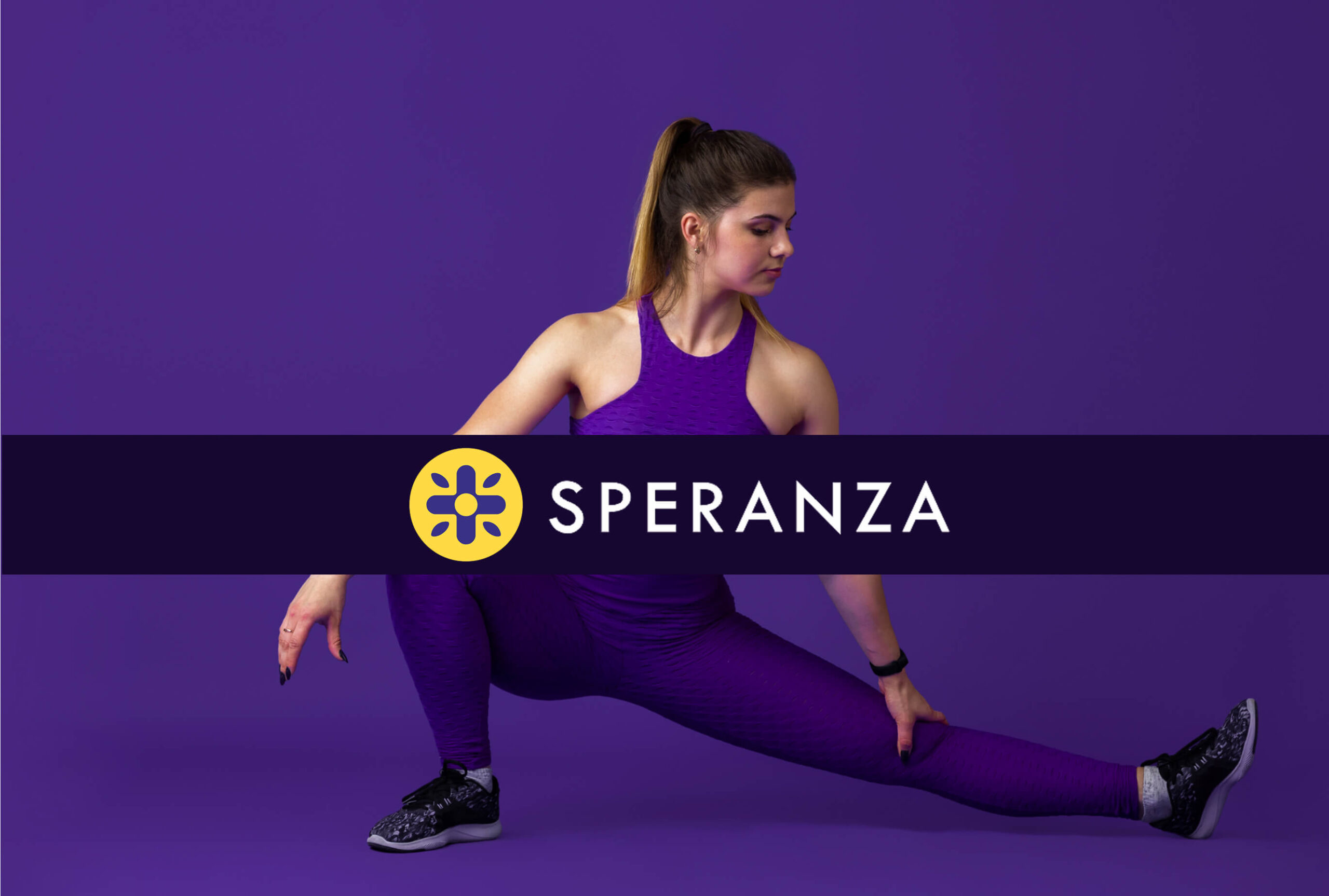
Sparenza uses deep purple and sunflower yellow - colours of dignity and hope - to uplift spirits and light every healing step.
A Halo of Hope amidst fear and uncertainty.
The sunflower icon serves as a consistent visual cue across photos and digital assets – reinforcing Sparenza’s core values of hope, dignity, and forward healing. It acts as a subtle yet powerful brand recall, reminding patients and families of the optimism at the heart of every journey.
Brand Icons
Revision Knee Replacement
Uni-Compartment
Knee Replacement
Total Knee Replacement
The sunflower-inspired service icons carry forward the message of dignity, hope, and seamless brand continuity in website
Hope blooms through sunflowers in waiting areas
These sunflower-inspired patterns were created to lift everyday moods, and gently brighten the in-between moments. From waiting areas to therapy rooms, each wallpaper carries a sense of care – wrapping the space in warmth, calm, and quiet optimism. Because when design is intentional, it doesn’t just decorate – it heals alongside you.
Brand Assets
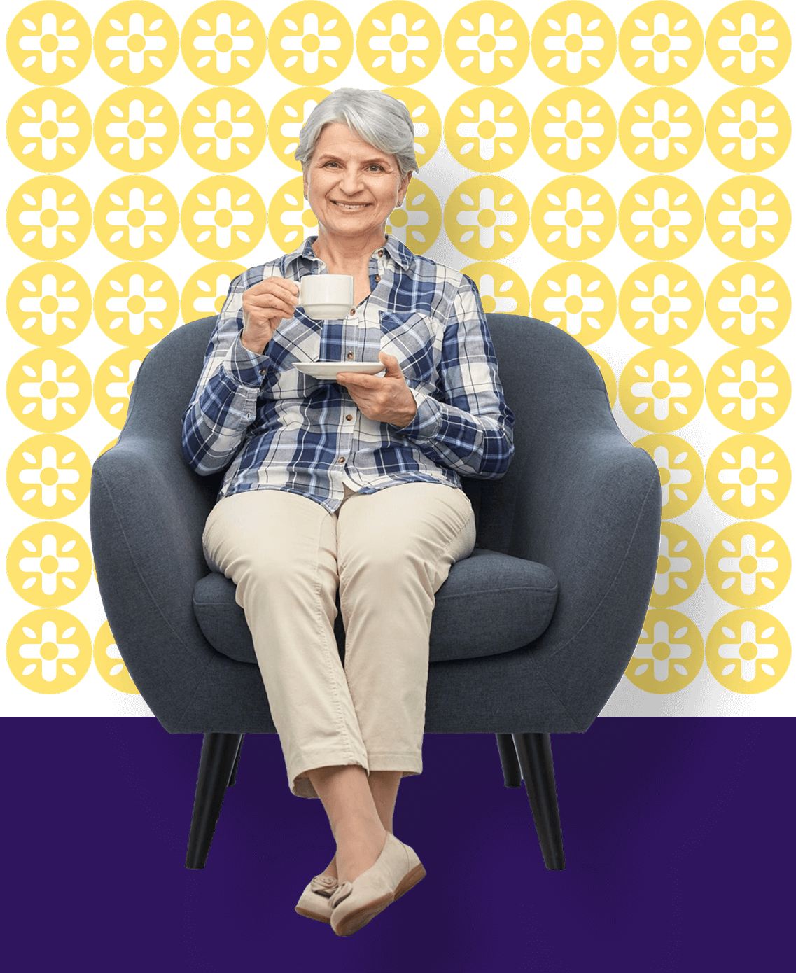
Photographic assets are thoughtfully infused with brand colours, reinforcing brand recognition across the website and social media.
Visual cues matter in medical communication.
We believe every element should speak the brand’s language. Even subtle highlights- placed thoughtfully around the knee – help focus the viewer’s attention while preserving a seamless visual identity.