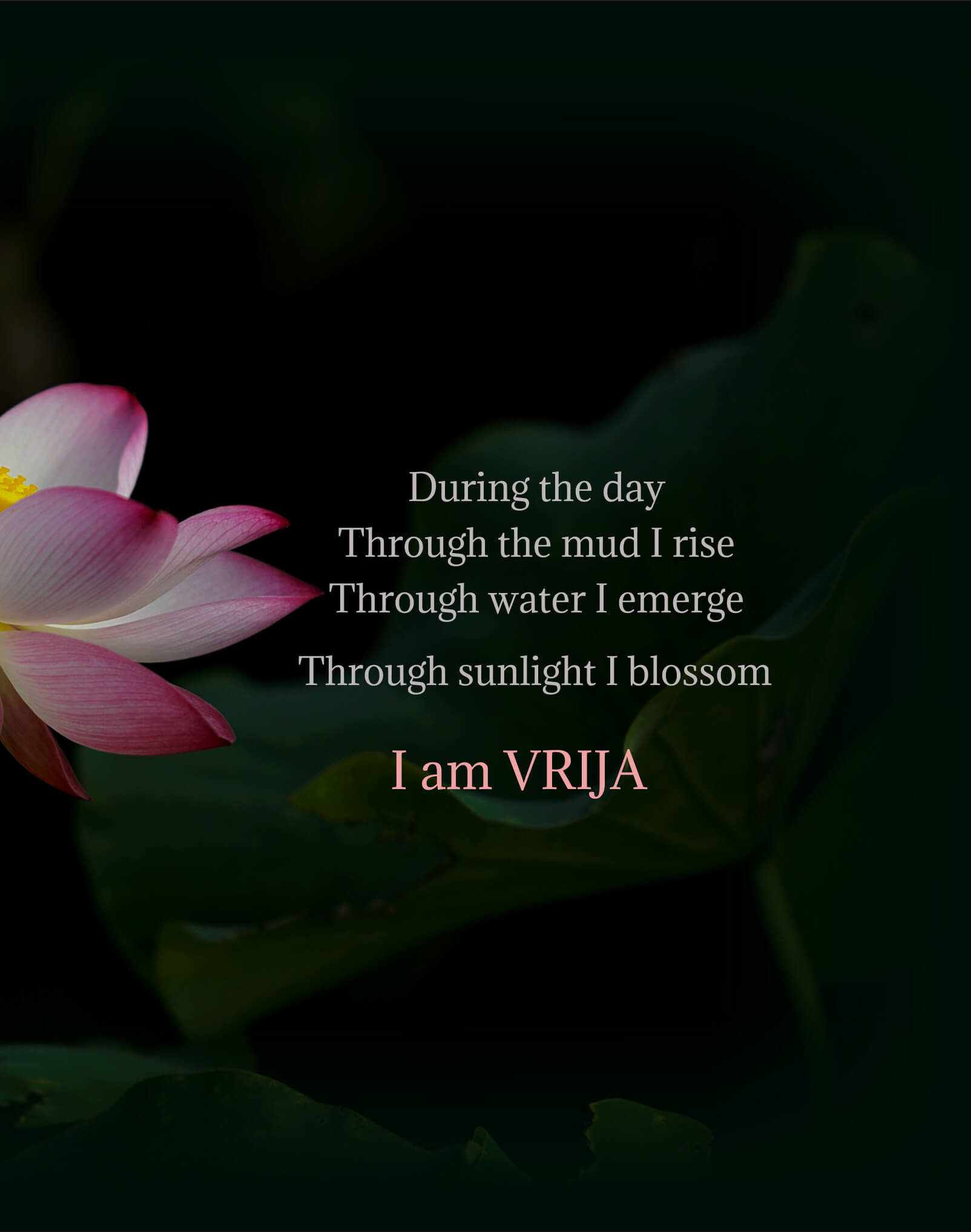
Inspired by the lotus that stays spotlesss in muddy waters, Vrija brings the same self-cleansing purity to your skin—fresh, clear, and effortlessly radiant.
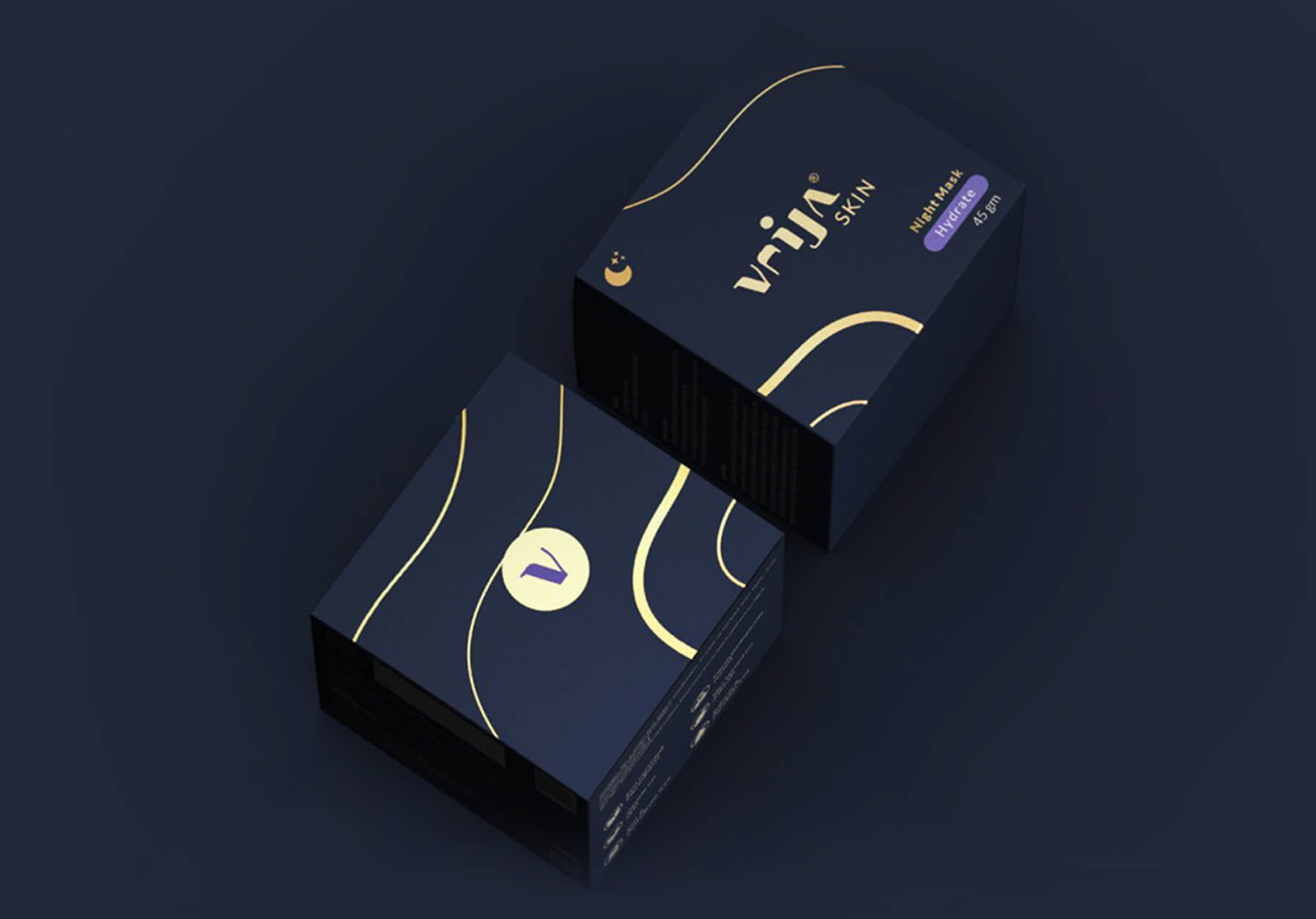
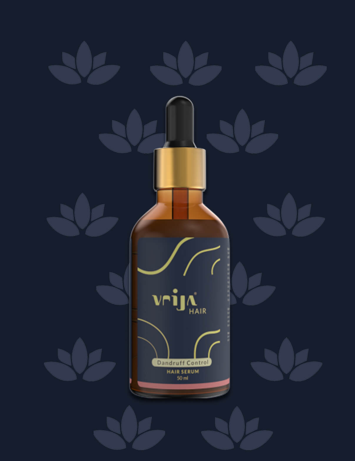
Vrija’s custom-designed font, inspired by the lotus, adds elegance to the packaging. Flowing lines echo the curves of a water lily, giving it a luxurious appeal
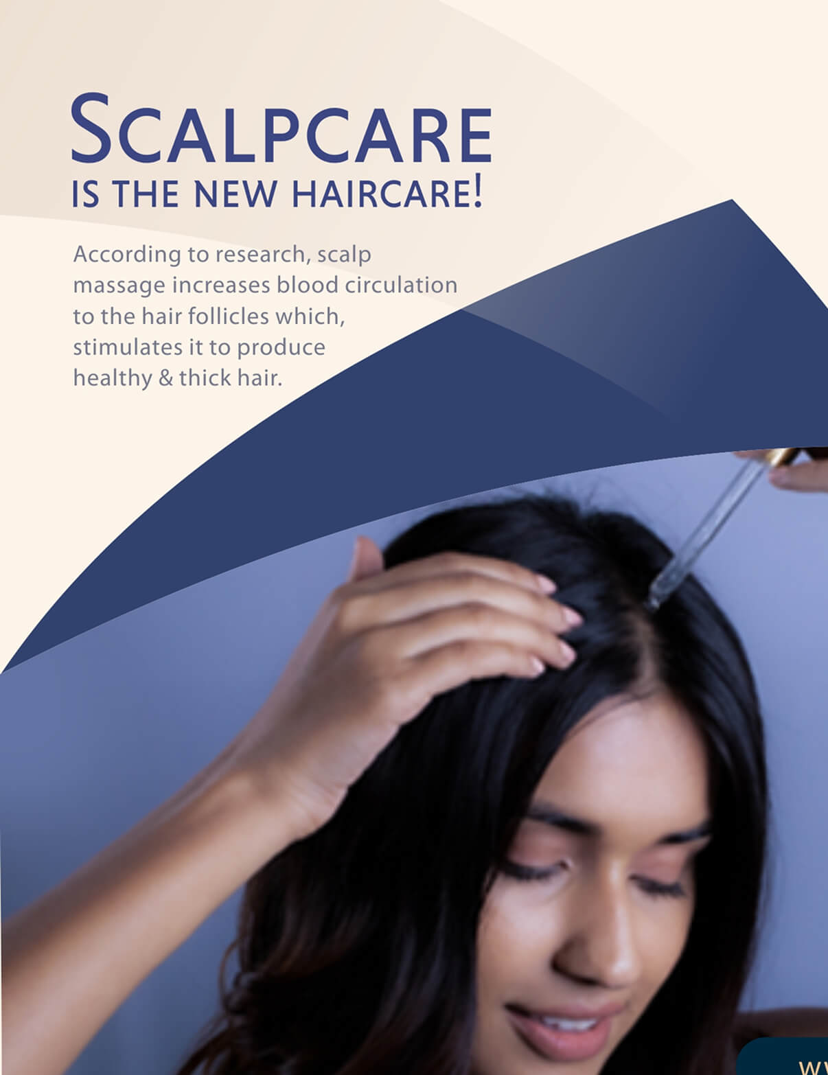
Social media creatives showcase the lotus effect
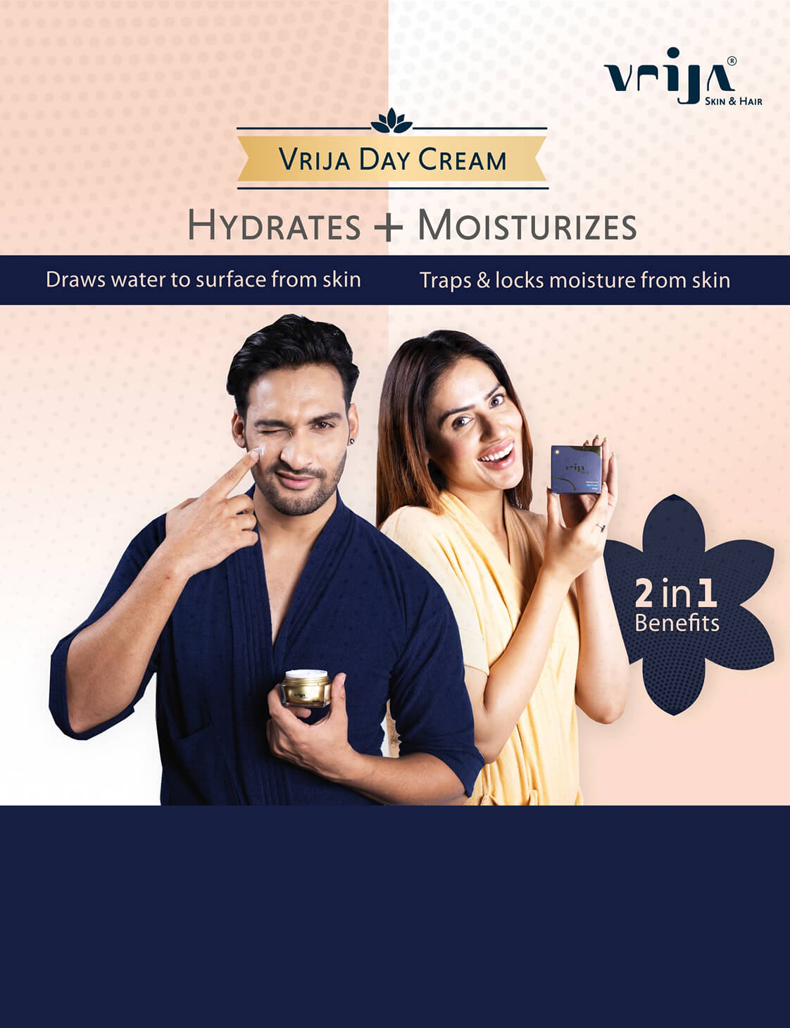
The refreshing halftone effect in the background conveys a sense of renewal and hydration, while the graphic lotus shapes elegantly frame the text, reinforcing brand identity. Models dressed in the brand’s signature colors—both male and female—endorse the unisex nature of the product, enhancing visual cohesion and ensuring strong, striking brand recall.”
Vrija Brand Story
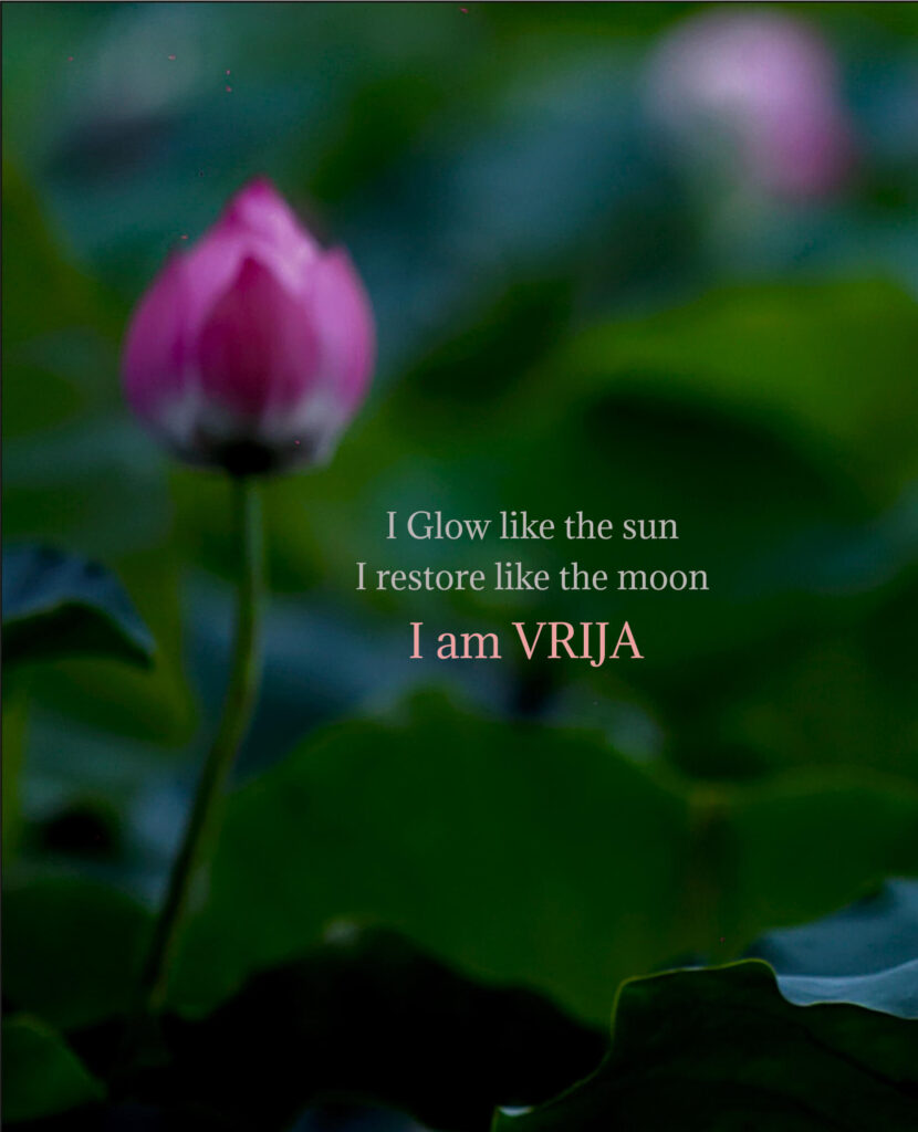
Vrija helps your skin rise, emerge, and blossom throughout the day.
Vrija helps you shine in daylight and rejuvenate by moonlight.
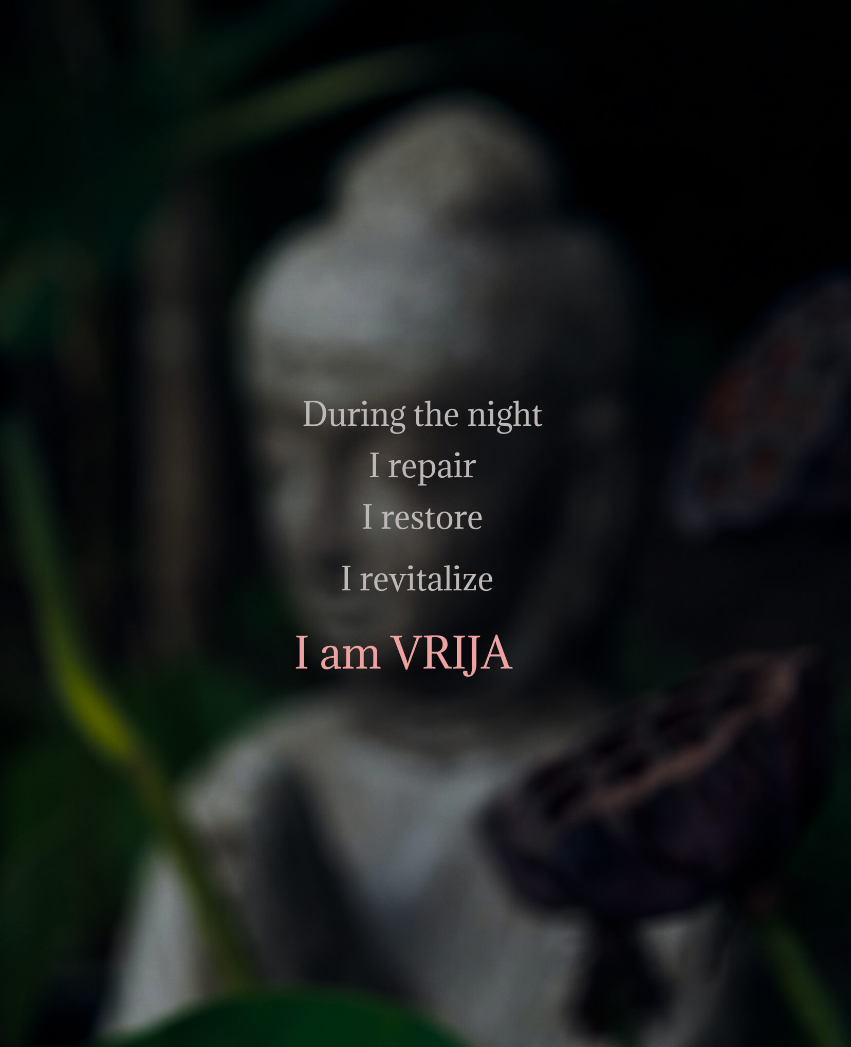
At night, Vrija repairs, restores moisture, and revives your skin’s glow.
At Nekh, we crafted a poetic brand story for Vrija Skincare—rooted in stillness, yet gracefully blooming with the rhythm of day and night
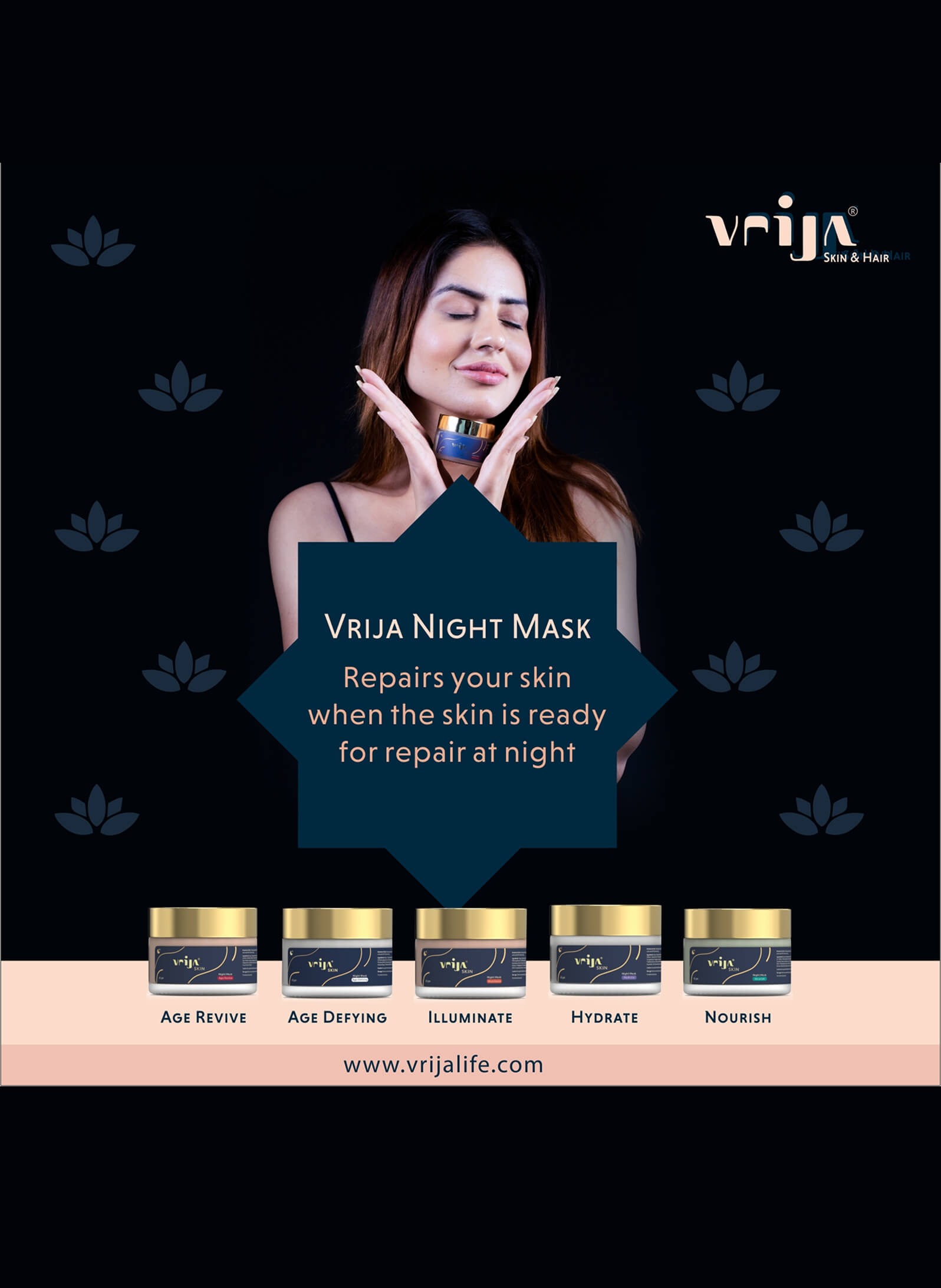
Website banner that blooms with the full Vrija range.
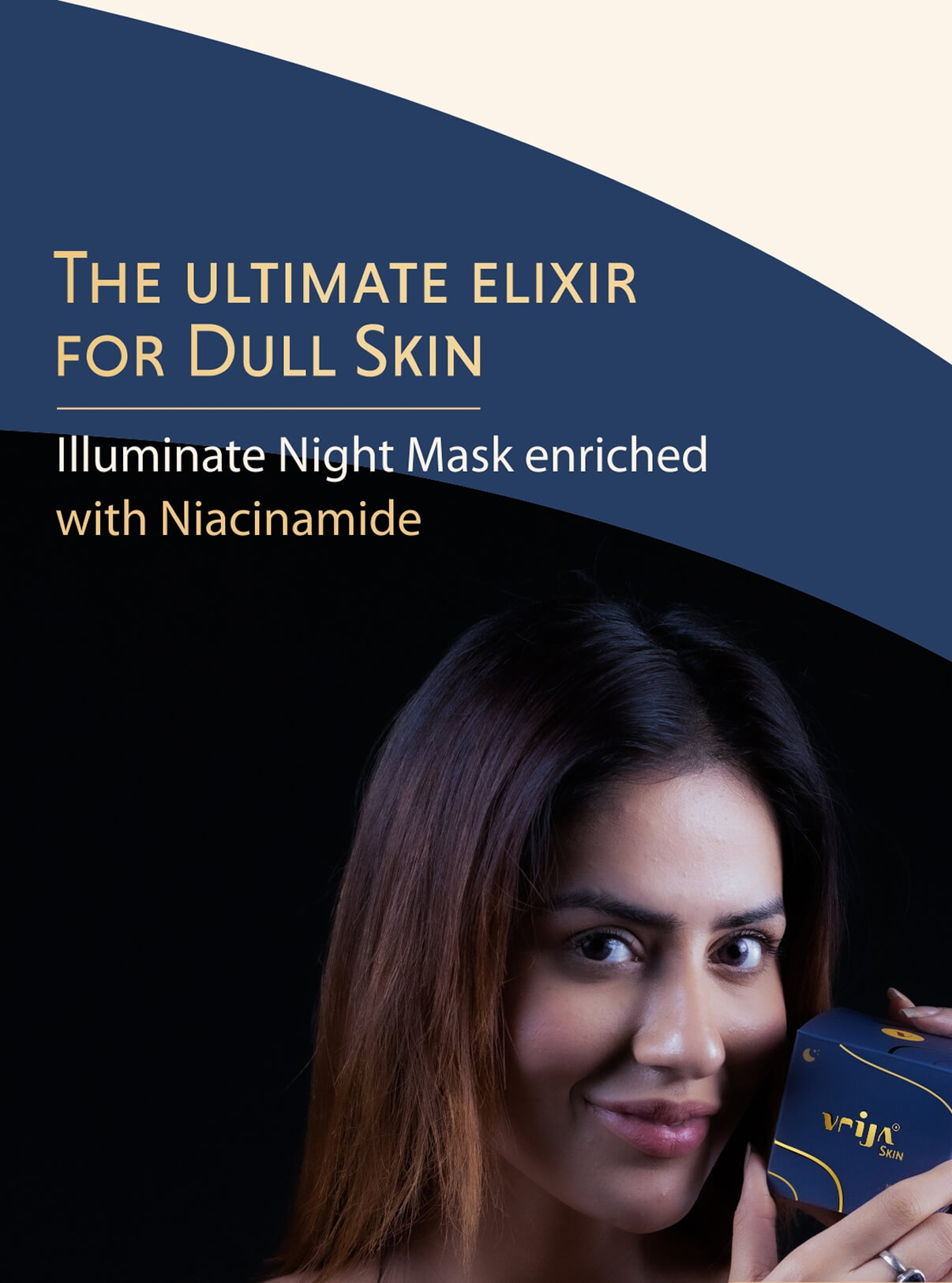
Social media and website assets were designed to showcase Vrija’s night skincare range—Age Revive, Age Define, Illuminate, Hydrate, and Nourish – while capturing the calm, restorative mood of the lotus.
Petal-inspired visuals, soft tones, and golden accents reflect the purity and elegance of the lotus, reinforcing the brand’s message of skin repair and renewal through the night.
Brand Assets
Lotus-inspired backgrounds and patterns embellish brand creatives, creating a cohesive visual language across all digital platforms.
When Lotus Becomes Vrija: A Brand in Full Bloom
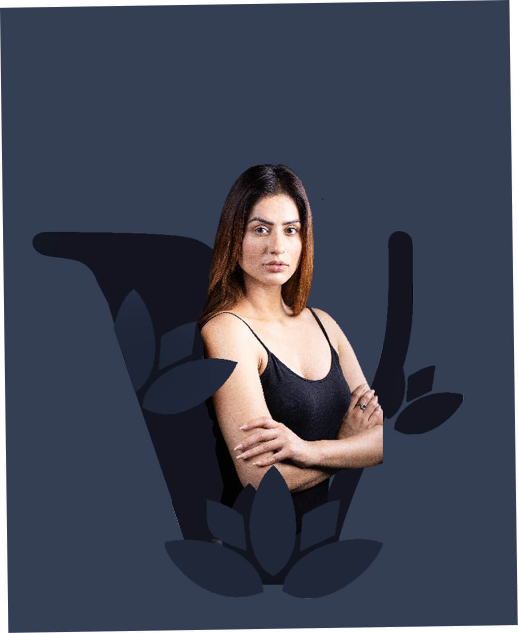
With Vrija meaning “lotus” in Sanskrit, the brand seamlessly integrates the flower’s symbolism into every detail. From product design and visual themes to model styling, each element is thoughtfully crafted to reflect the purity, strength, and elegance of the lotus. This unified approach strengthens brand recall, making Vrija and the lotus one and the same in the minds of consumers.